
I’ve been dissatisfied with my WordPress blog theme for many months, but the time and potential headaches involved in making a change to this design have held me back from trying something new. This evening, because I needed to install the Contact Form 7 plug-in to use on a new “Speaking” page I created, I installed and configured the free LightWord WordPress theme here. The most time consuming part was resizing my header graphic, which I was able to do with SeaShore. (A free Mac port of The Gimp.)
I’m increasingly drawn to simple web designs. I acknowledge my three-column layout with multiple widgets does not allow my current blog design to qualify as “minimalistic” by the standards of Jim Groom’s homepage, but I think my new design is a slight improvement over the old. The jury may be out on this, however, based on the results of this xhtml-css validator.
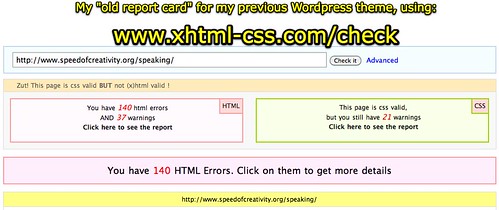
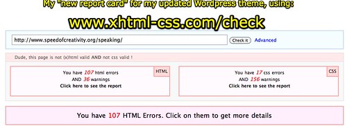
I don’t have time or the desire to look at these problems now, but may down the road. The big benefit is the stylesheet included with Lightword formats the contact forms created by Contact Form 7 so they are readable and usable, unlike my previous theme. My blog posts and pages seem to look fine in Chrome, FireFox and Safari on my Mac. Not sure how they’re looking on IE yet, but I’ll check.
If you have feedback / suggestions / thoughts on this theme change, I’d value your input.
Technorati Tags:
css, theme, validate, wordpress
If you enjoyed this post and found it useful, subscribe to Wes’ free newsletter. Check out Wes’ video tutorial library, “Playing with Media.” Information about more ways to learn with Dr. Wesley Fryer are available on wesfryer.com/after.
On this day..
- Inspired by Innovative OKCPS Teachers and Students at Arthur Elementary School – 2018
- Using Google Reverse Image Search to Create a (late) Bibliography – 2016
- Podcasting Costs with Amazon S3 – 2016
- Show What You Know with Media (Feb 2015) – 2015
- Why Our Family Ditched AT&T and Joined T-Mobile: Huge Monthly Savings – 2014
- A Vision for Interactive Writing, Student Publishing, and Digital Portfolios in the Classroom – 2013
- Where to Start with Technology Integration in Oklahoma? – 2012
- We’ve Only Just Begun (to share our voices with media in Yukon Schools) – 2012
- Piano Scales? There’s an App For That! – 2011
- Creative Commons and Flickr – 2010
Comments
8 responses to “New WordPress design thanks to Lightword”
Slow to load the 2 columns on the right.
No place that said “leave a comment” until I clicked “no comments.”
Could it use a bit more color in the top bar?
Why all the airplanes?
The slow loading has been a problem for awhile – part of that is the delicious.com widget, but overall using so many widgets increases the load time. I may experiment with removing some of them and comparing load times.
I agree the commenting could be more obvious. I may investigate the possibility of having someone alter/customize this theme. Certainly it could use more color at the top, but the simplicity of the theme is also a drawing card I think.
As far as the X-Wings, I’d say that’s a reflection of my personality and the idea of “moving at the speed of creativity.” X-Wings move pretty fast. 🙂
Yes, I do like the simpler format, too. I really do!
Still, I think there are too many X-wings. I like the speedy one across the top, but don’t see the need for the 3 extras between the mics – even tho I know you happily & successfully move at hyperspeed. 🙂
What about having the “the weblog of wesley fryer” not in bold — seems a little blurry?
I would like to fix that graphic, but I don’t know where the original one is at this point that has layers I can adjust separately. Originally I included more graphics on the right because my blog template was set to expand to 100% of the browser window, so when people used very wide screens they would see that. In the older version the right side of the banner was hidden and not displayed, so this really isn’t a “new” image it’s just that more of it is visible in this fixed-width design template. I do think I’m going to visit with one of the WordPress designers who attends our monthly user group meetings, and see if this is something I can hire him to help with.
Glad you do like the simpler format.
I took your suggestion and removed the extra X-Wings from the banner image. Instead I put text about my updated handouts/presentation calendar site. Better?
Thanks for your input and dialog on this. 🙂
Yea — good!
Great job, Wes. I like the new look tremendously. Slimmer, better…get rid of the Contributions and Connections, though. I like to see visitor comments featured right, on par with top 10 blog posts. just a suggestion….
I’m looking to change my general look-n-feel but it’s such a pain!!
8->
Thanks for the feedback, Miguel! With WordPress, changing design and look/feel is far less painful than with other web publishing platforms I’ve used, but it can still get tedious… I removed the “Contributions and Connections” sidebar widget and moved top posts and recent comments up in both sidebars, per your suggestion. I kept k12online at the top, but moved down my subscription and about widgets. I also removed my delicious badge but left a link… that particular badge was really slowing down the load time for my site, from what I can tell.
Any other suggestions you have, based on these changes. I appreciate the feedback. 🙂