
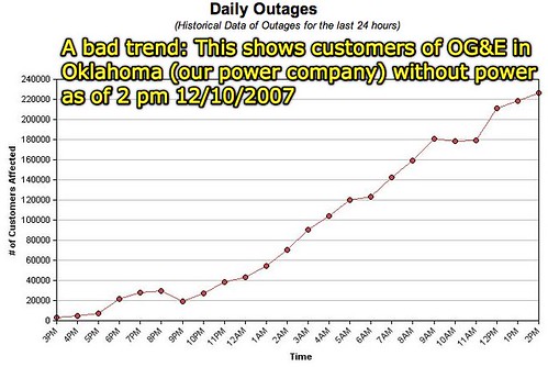
I’ve been keeping watch from time to time this week on the dynamically generated graph from our power company (OG&E) showing how many Oklahoma customers have been without electricity. On an aggregate basis, according to this morning’s Daily Oklahoman newspaper (NewsOK.com) over 600,000+ people are still without electricity statewide. My first screenshot from December 10th shows approximately 220,000 OG&E customers without power as of 10 am. Note the scale of this graph: There is a new line on the y-axis for every 20,000 customers:
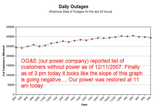
The next day, in the late afternoon of December 11th, the OG&E system watch graph showed 300,000 customers without power. The y-axis graph scale had been changed however: Now it shows a new line for every 50,000 customers:
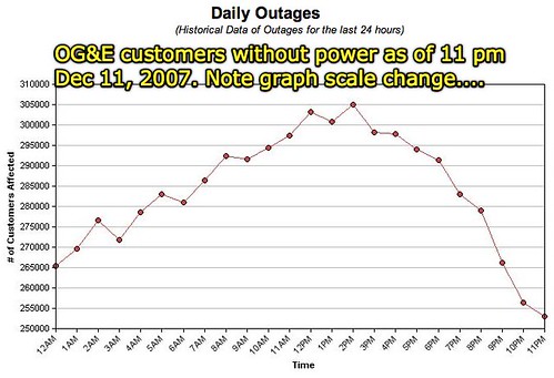
Last night, before going to bed, I noted the graph had changed again, showing a reduction in customers without power down to about 250,000. Again, however, the scale of the graph had changed, this time to show a new line on the y-axis for every 5000 people:
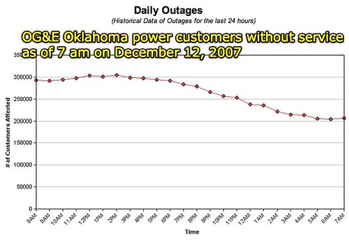
This morning’s graph shows that about 200,000 OG&E customers are without power currently. The scale of the y-axis has changed again, however, reverting this time to the original scale with a new line every 50,000 customers:
What are the implications of these graphs? (What do they mean in real terms?)
Does it matter that the y-axis scale has changed every time I’ve looked at the graph?
Is a positive slope on this graph good or bad?
Why does a negative slope bring hope?
How does a different scale on these graphs present a different perspective on the numbers of people either losing or gaining power in the OG&E electrical grid?
Does that matter from a public relations perspective?
As a saavy citizen, should we care?
How could we create a consistent graph, with the same scale, which accurately shows these changes over time?
I used the free US Department of Education’s online graphing tool from their Kidzone area to graph the following table of data:
- Dec 10th – am 220,000
- Dec 10th – pm (no data)
- Dec 10th – late pm (no data)
- Dec 11th – am (no data)
- Dec 11th – pm 300,000
- Dec 11th – late pm 250,000
- Dec 12th – am 200,000
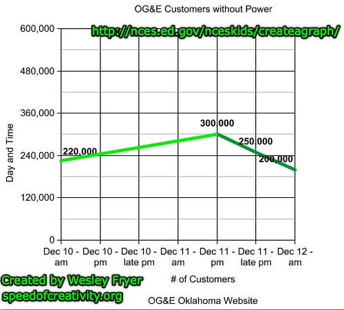
I didn’t have data points for the 2nd, 3rd and 4th data points, so the line between the 1st and 5th data points is extrapolated. I added that line and the text annotations with Skitch, which I also used to immediately upload the finished image to Flickr. (I LOVE Skitch!) Lots of math connections here for sure! They key is, on a personal level, that the slope of the graph is now negative! Our family in southeast Edmond lost power at approximately 4:30 am on Sunday, December 10th. We got power restored briefly four different times on Monday. The shortest period of restored power was for 10 seconds, the longest period was 2 1/2 hours Monday evening. We got power back (apparently for good, since it has stayed on since) at approximately 11 am on Tuesday, December 11th.
Challenging students to use real-world data like this and think critically about it, as well as CREATE their own versions / knowledge products which reflect their own understanding of what the data MEANS is a valuable way to spend instructional heartbeats inside and outside of class.
Technorati Tags:
graph, graphing, education, school, oklahoma, electricity, ice, storm, icestorm, power, skitch
If you enjoyed this post and found it useful, subscribe to Wes’ free newsletter. Check out Wes’ video tutorial library, “Playing with Media.” Information about more ways to learn with Dr. Wesley Fryer are available on wesfryer.com/after.
On this day..
- Things I’m Learning about HDMI Cables – 2017
- Selectively Auto-Sync Local Files to Google Drive – 2016
- iOS Movie App Recommendations from Tim Tyson #edapp – 2010
- PhotoShop, Art, and Ning Collaboration with Students in Maine and China – 2010
- 365 Photo Blog: Posterous, WordPress or just Flickr? – 2010
- A Lesson Idea About Our Inherent Value as Human Beings – 2010
- Linda Darling-Hammond has my vote for SOE – 2008
- No sidetrips for learning today – 2006
- Preparing teachers of digital immigrants – 2005
- Skype Headsets, Pamela, WeeMees & Videoconferencing – 2005
Comments
2 responses to “Watching graph scales during our ice storm”
The scale changes aren’t what bother me – it’s the third graph where the y-axis doesn’t start at zero anymore. It makes it look like they have got the problem licked, when all they have done is a 1/6th reduction in the number of people without power – a quarter million were still in the cold and dark! That’s the graph that is deceptive.
(A good example for science classes as well as information literacy classes!)
Hey Will,
This is definitely a great idea to break out in the classroom… once the schools reopen that is.
It is not much better in the Little Apple either. On Tuesday, December 11th at 7:30 AM almost 13,000 customers in Riley Co. were without power. That number ballooned to approximately 17,000 later on that day. As of now, 13,000 Westar Energy Customers in Riley Co. are still without power. This number is not staggering by itself. However, if you compare it to the number of Westar Energy customers in the county (27,500), you can begin to sense the magnitude of the recent ice storm. It has been reported that those who live in the rural areas may not have power for another week.
Yesterday was a bit rough. The only restaurant my wife and I could get into for a hot meal was Vista Burger on Tuttle Creek Blvd. There was a line out the door for walk-ins and the parking lot was jammed with folks trying their luck in the drive-thru. One employee at Vista said that they had not seen this many people at one time since before McDonald’s came to town.
Manhattan is slowly coming back on-line. Regina’s in Aggieville has free wifi and hot coffee. We have camped out here for the better part of the day among all of the undergraduates cramming for final exams.
I hope all in OKC is powered back up soon. Good luck.
Matt