
Huge numbers of people today are accessing Internet websites on mobile devices, so it is imperative content publishers pay attention to the way websites display on smaller, handheld screens. A webpage that looks readable and well laid out on a laptop screen can look terrible on a smartphone. As educators publishing curriculum, classroom updates, and student work on websites, we ARE (and need to increasingly become) CONTENT PUBLISHERS. In this post, I’ll describe how I used the WordPress plugin “PluginBuddy Mobile” this evening to optimize and improve the mobile display of this WordPress-powered blog and website, “Moving at the Speed of Creativity.” For more on this topic, see my newly updated conference breakout session links for “Mobile Apps & Curriculum for Your Class.” Please also see the full disclosure paragraph at the bottom, explaining my current relationship to iThemes and how I obtained a free copy of PluginBuddy Mobile via the iThemes Educator Program’s “WordPress Web Designer’s Toolkit.”

According to the February 2011 report, “A closer look at generations and cell phone ownership” by The Pew Internet & American Life Project:
Eighty-five percent of Americans age 18 and older own a cell phone, and one-third (33%) of those who do not own a cell phone live in a household with at least one working mobile phone.
As I write this in late July 2012, I know those numbers have only continued to grow. While the digital divide is REAL and not all students or families have cell phones or Internet connectivity options, increasing numbers do and their ranks are swelling. This presents opportunities as well as challenges for educators. One of these is MOBILE ACCESSIBILITY to Internet content. If you’re going to publish something online today, you definitely need to be paying attention to mobile renderings of your pages. This process can be referred to as “mobilizing” your content.
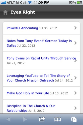
Prior to this evening, I’d used two different, free WordPress themes to “mobilize” different blogs. “WordPress Mobile Edition” by Crowd Favorite is a free WordPress plugin which I use on a few sites, including “Eyes Right,” my Christ follower blog, as well as “Learning Signs,” our family learning blog. It was the first mobile WordPress option I found and used. This solution requires activation of both a plugin and a special WordPress theme to work. You can see the mobile version of “Eyes Right” on an iPhone, using this mobile option, below.
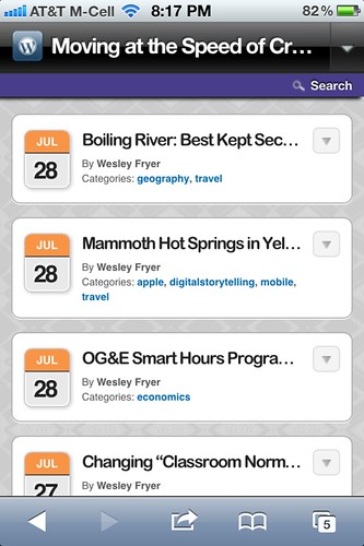
The second WordPress mobile option I’ve used, and actually used more extensively because I preferred it, is the free WP-Touch plugin. I like the display of WP-Touch on an iPhone better than the simpler version by Crowd Favorite, but it’s still limited in important ways. Below you can see the homepage of my blog on an iPhone BEFORE tonight’s updates, when I was still running WP-Touch.
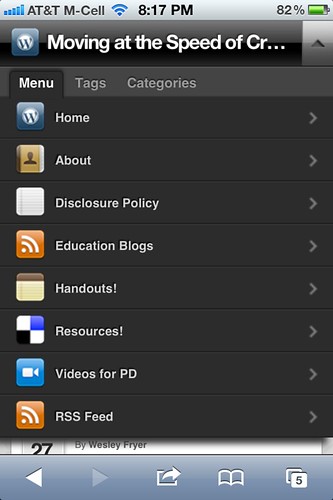
In the screenshot below, you can see the available menu options available previously on my WP-Touch mobile blog version. This menu had to be built MANUALLY in the plugin settings for WP-Touch, and was not as comprehensive and helpful as the “main website” navigational menus I’ve built.
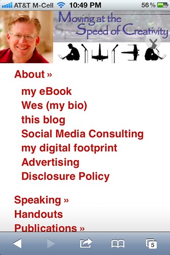
This evening, thanks to a tip from Cory Miller, I checked out, installed and configured the WordPress plugin “PluginBuddy Mobile” to mobilize my website. In the screenshot below, you can see what my new iPhone mobile blog site looks like as I’ve configured it. Notice how I’m able to use a customizable 450 x 150 header image, which is not possible (as far as I know) with the other two WordPress mobile options I’ve mentioned.

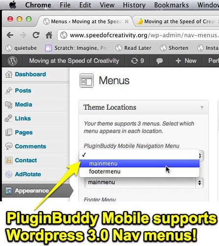
The number one, MOST important reason I decided to give PluginBuddy Mobile a try tonight is its support for WordPress 3.0 custom menus. This is HUGE for me, because I’ve spent a fair bit of time creating custom, ‘nested’ menus for my regular / non-mobilized WordPress site to provide useful links to visitors. It’s troubled me in the past that those same menus have NOT been available to mobile users. Now, however, they are! After logging into the WordPress dashboard, I clicked APPEARANCE and then MENUS to select my SAME header navigational menu for my mobile theme as I use with my “standard” WordPress theme.
In the screenshot below, you can see how my five main “parent” menus are shown when a mobile user clicks the small arrow on the right side of the blog header image.

When a mobile blog visitor clicks one of the parent menus with more child menus, shown as a double arrow pointing to the right, those menu options open up below. This is a GREAT feature I’m very enthused about!
If you’re a WordPress user, I definitely encourage you to check out PluginBuddy Mobile. If you’re an educator, apply for the free iThemes Educator’s Toolkit, which includes PluginBuddy Mobile. I really like it and especially like the way it provides support for my existing WordPress 3.0 menu structure. Check out this six minute tutorial video to learn more about how to configure PluginBuddy Mobile.
Full Disclosure: As detailed on my blog disclosure policy, I’m working on a contract for iThemes as a “hired blogger” over on the iThemes Education Blog. As an educator I applied for and was accepted to receive the WordPress Web Designer’s Toolkit from iThemes for free. I encourage you to subscribe to the iThemes Education blog, where I’m regularly posting about WordPress and helpful tips / suggestions for educators. You can also follow @ithemesed on Twitter to stay updated. I’m not cross-posting the content I share there, so you’ll have to visit or subscribe to the iThemes Education site to get it!
Technorati Tags: access, edtech, education, mobile, plugin, technology, WordPress, mobilize, ithemes, pluginbuddy, accessibility
If you enjoyed this post and found it useful, subscribe to Wes’ free newsletter. Check out Wes’ video tutorial library, “Playing with Media.” Information about more ways to learn with Dr. Wesley Fryer are available on wesfryer.com/after.
On this day..
- Contrasting Video Messages: Goodnight iPad and Cheryl and Morgan: Learning Independence – 2013
- The Hobbit in Five Minutes [Video] – 2011
- Look for innovations which change the script – 2010
- A delicious facelift, skypecast drawbacks, and a new Flickr site – 2008
- Drupal versus Ning for Learning Community Websites – 2008
- links for 2008-07-31 – 2008
- Drupal dabbling begins – 2008
- Glimpsing the future of television – 2007
- Whitelisting websites – what a pain! – 2007
- Quick iTunes Backup – 2007