
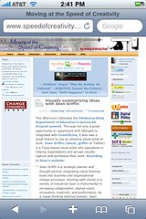
The mobile web is huge and growing. No one creating content for the Internet today should ignore it. If you use a WordPress blog, the free WordPress Mobile 3.0 plug-in offers a seamless way to provide a customized, mobile-web friendly interface for your visitors viewing your site on an iPhone, Android-compatible phone, BlackBerry, or other web-enabled phone. Before installing the plug-in, this is what my WordPress blog looked like in the Safari web browser on my iPhone:
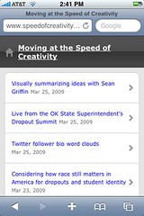
After installing WordPress Mobile 3.0, it looks like this:
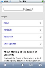
At the bottom of the mobile-theme, WordPress “pages” are linked and accessible:
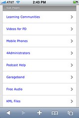
If you have WordPress pages setup as “nested” child pages (as I do) it’s great to see these sub-pages are also accessible via this mobile WordPress theme:
Installation of WordPress Mobile Edition requires two different file uploads to your wp-content directory: a folder with the mobile WordPress theme files, and the actual plug-in to your plug-ins folder. After activating the plug-in, your WordPress blog will automatically detect if a user is browsing with a mobile device and present the mobile-friendly theme interface to those users automatically. Non-mobile users continue to see the “regular” WordPress interface as before, and essentially remain unaware that the mobile version/option is available.
I am extremely pleased to have found this plug-in (while I was installing TwitterTools today on Eyes Right, incidentally) because I’ve worried my blog sidebars have too many slow-loading graphical badges. I’d like to provide a link on the top of my “regular” blog theme indicating “A mobile version of this blog is available,” but I’m not sure how to do that presently. Alex King, the developer of the WordPress Mobile plug-in, has a demo of the theme running on mobile.carringtontheme.com which can be viewed via a “regular” (non-mobile) browser.
For more websites and tips on creating content for the mobile web, check out Karen Montgomery‘s workshop curriculum “Think Handhelds.”
Technorati Tags:
wordpress, plugin, mobile, blog, accessibility, access, mobileweb, web, technology, iphone, android, blackberry, smartphone, cellphone
If you enjoyed this post and found it useful, subscribe to Wes’ free newsletter. Check out Wes’ video tutorial library, “Playing with Media.” Information about more ways to learn with Dr. Wesley Fryer are available on wesfryer.com/after.
On this day..
- Google Cloud Print Not Working with Brother Printer – 2016
- Value of Low Tech: Paper Slide Videos – 2013
- WordPress Basics by Lisa Sabin-Wilson – 2012
- “Mapping to the Core” LiveBook with Heidi Hayes Jacobs – 2012
- Deep, Deep Dive into Digital: It’s Wild in There! by Hall Davidson #pbtechconf – 2010
- Charting a Course for Technology in Florida by Dr. Kate Kemker #pbtechconf – 2010
- Creating Immersive Learning Environments with Mixed Media by David Jakes #pbtechconf – 2010
- 19 Oklahoma Schools Receive 2010-2011 1:1 laptop grant funds via ARRA – 2010
- Now this is a SLOWWWWW Internet connection – 2008
- Fast Company mention – 2007